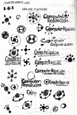
A few years ago, I met some works of Mike Rohde. I liked so much the way he managed the design process of logos, and specially the way he worked integrating text and drawings at his sketchbooks. In his web site you can read (and see!) how he engages the process of design, and how the client gets involved and takes part in this step by step design. To have an example, Mike Rohde first designs in black and white, and only at the end color comes.
As an architect, I’m very interested in those creative processes, specially when they search simplicity and integration of different problems. But I also know logo and graphic design in general has to be someway visual attractive, and it is much more liable to become fresh and free than architecture does. I advertised me, and most part of architects I think, when tried to sketch and finalize a logo design, the result uses to be someway motionless, gridded, and not very dynamic.
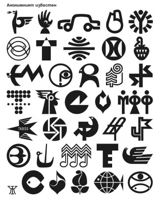
Some months ago I met The Work of Stefan Kanchev.

His designs are graphically powerfulled so they actually don’t need any text or color to have sense. You can add them after if necessary. I think this is so useful and so smart; the logo is much more adaptable to any context and the essence remains being the same after so many changes.
Thank you both for so many inspiring works!


